

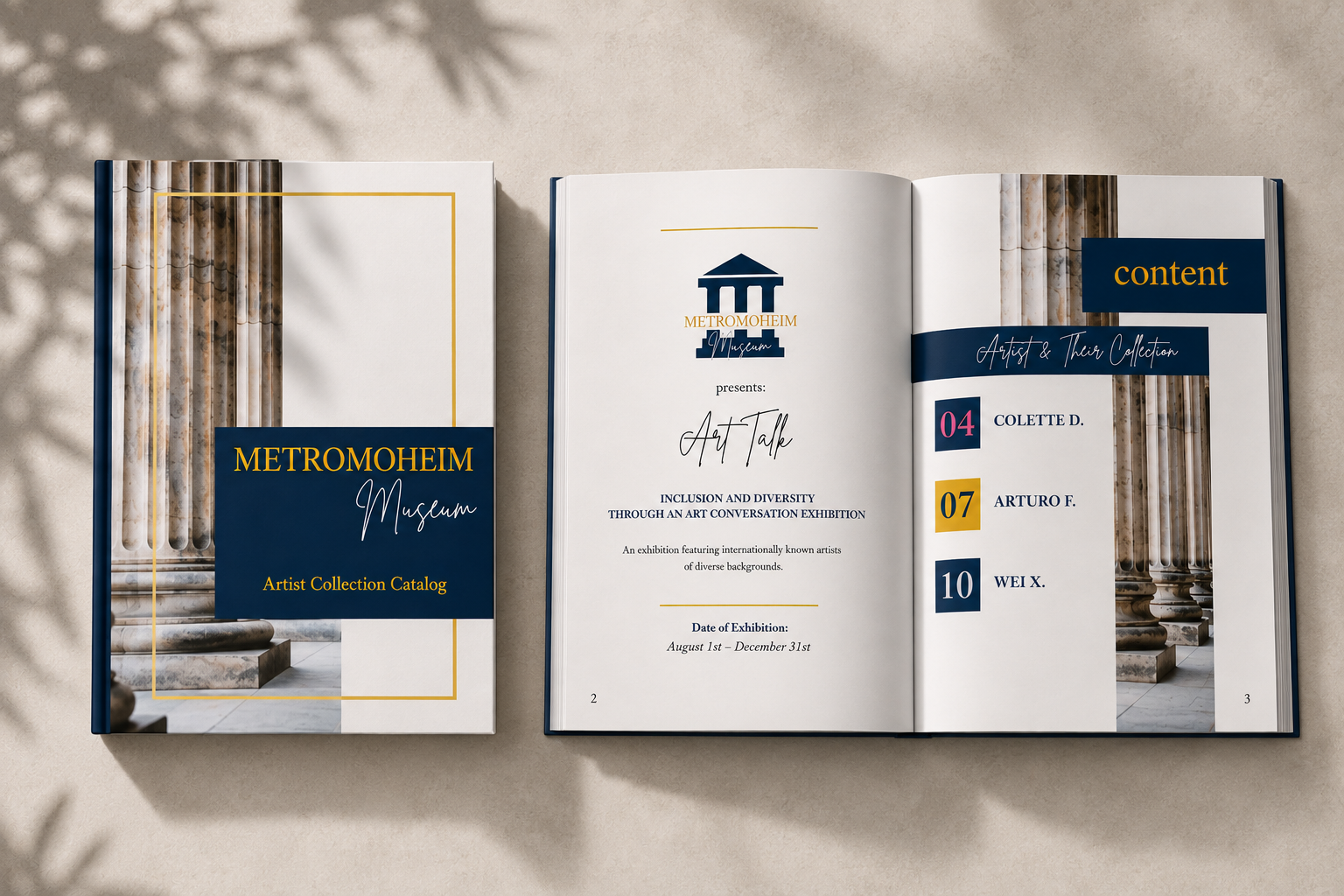
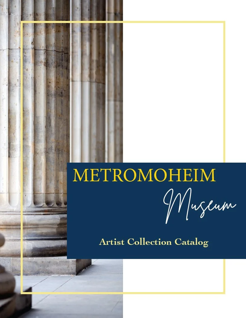
Metromoheim Artist Collection Catalog
Designing a cohesive editorial system that celebrates diverse artists while creating a consistent museum experience.
-
Role: Graphic Designer
Project Type: Editorial Design
Tools: Adobe Illustrator • Adobe InDesign
Deliverables: Artist Collection Catalog -
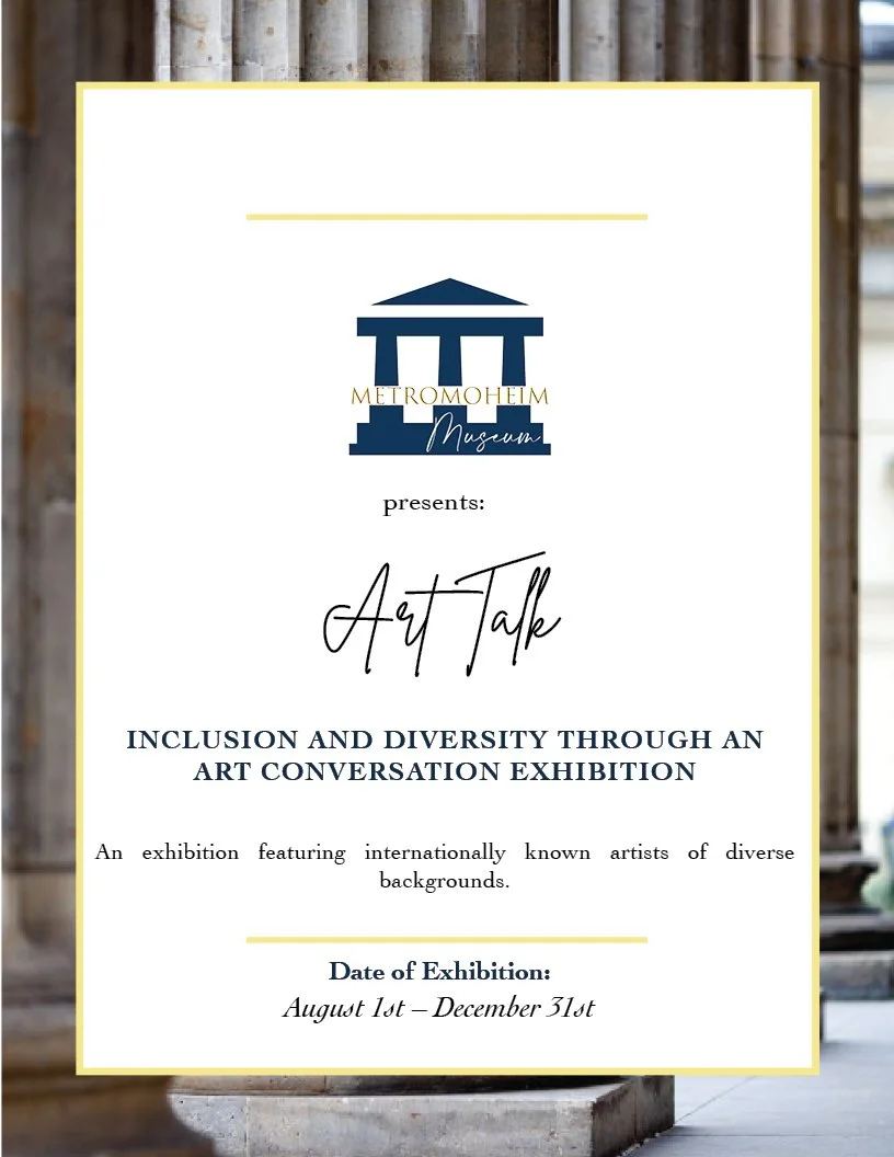
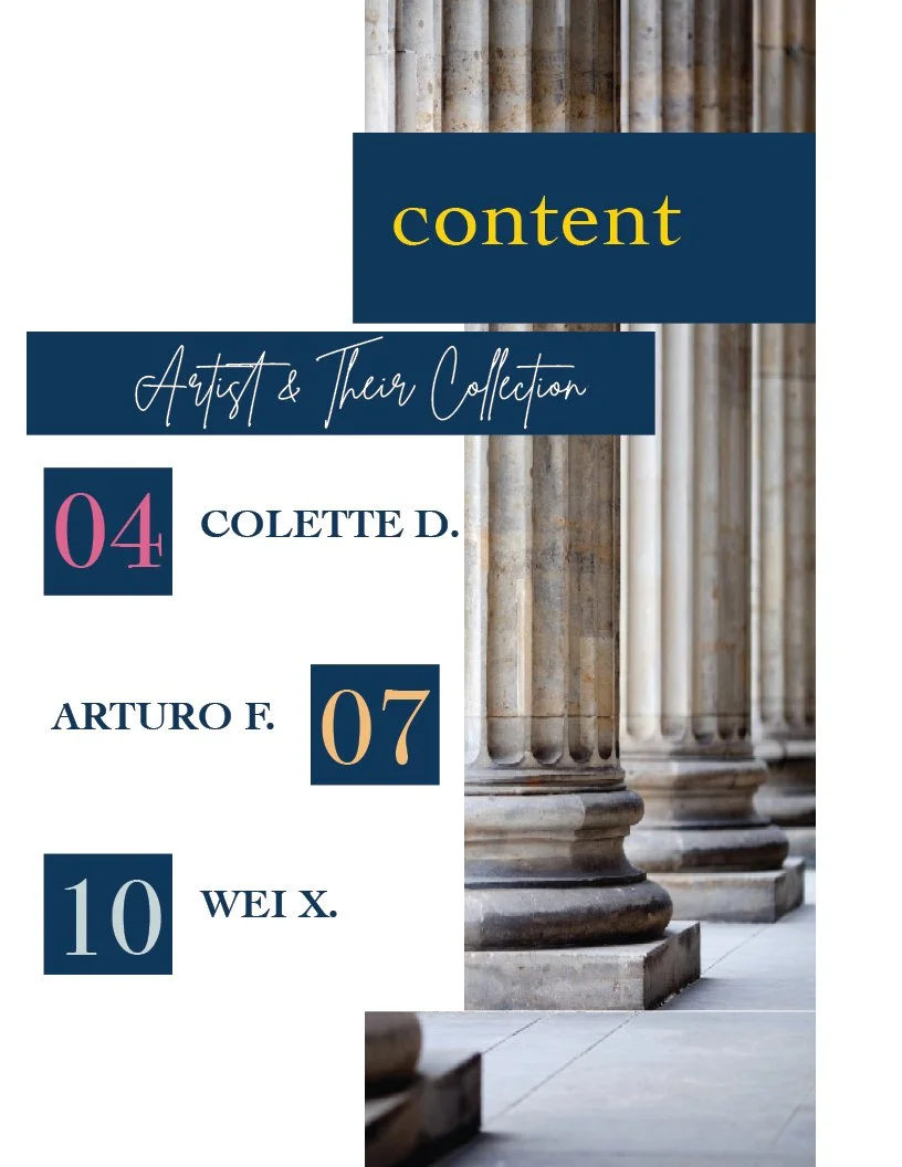
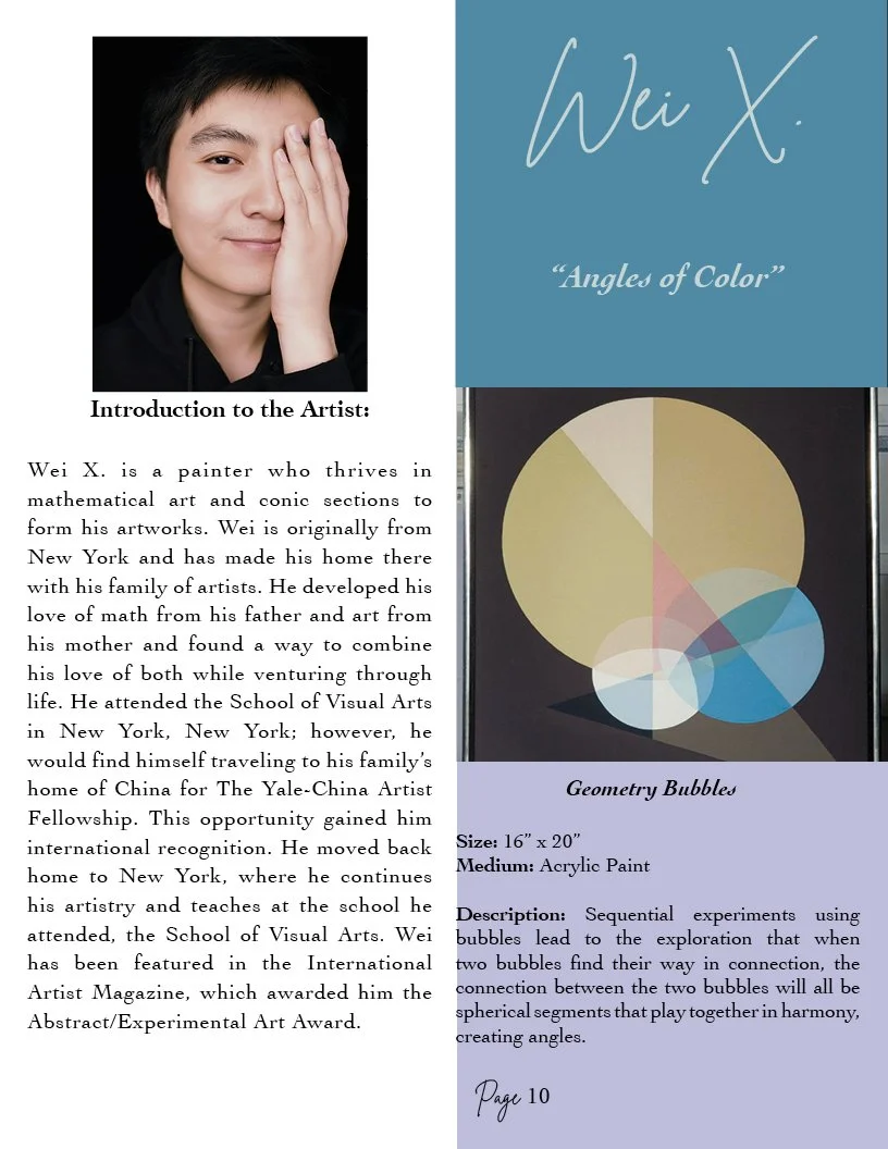
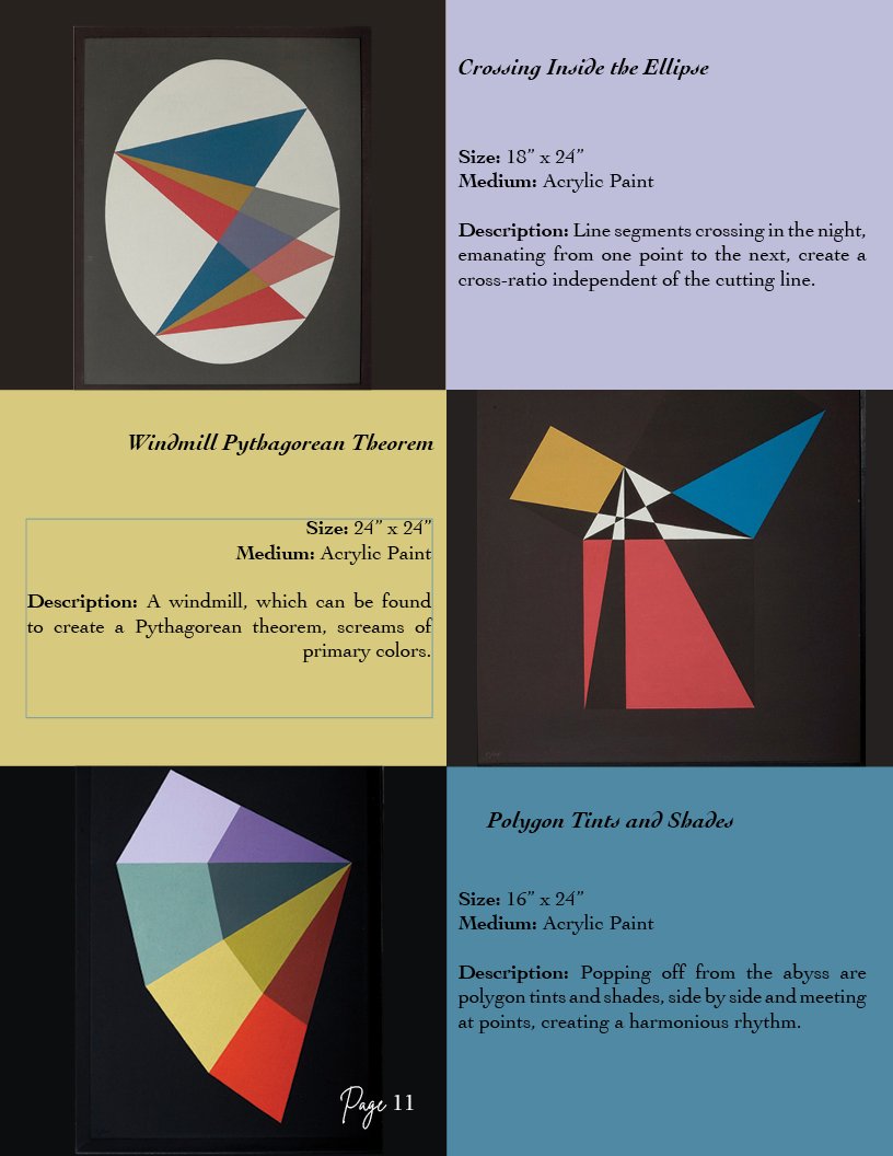
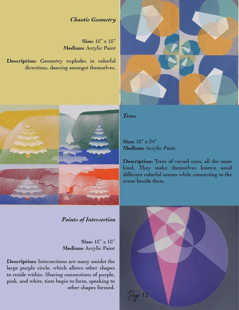
Metromoheim Museum Artist Collection Catalog is a multi-page editorial publication created to showcase a fictional museum exhibition featuring artists from diverse backgrounds and disciplines. The challenge was designing a cohesive catalog that balanced rich visual storytelling with clear organization, allowing each artist's unique voice to shine while maintaining a consistent and engaging reading experience.
-
Typography
Layout Design
Editorial Design
Information Hierarcy
Design Decisions

Consistency Without Repetition…
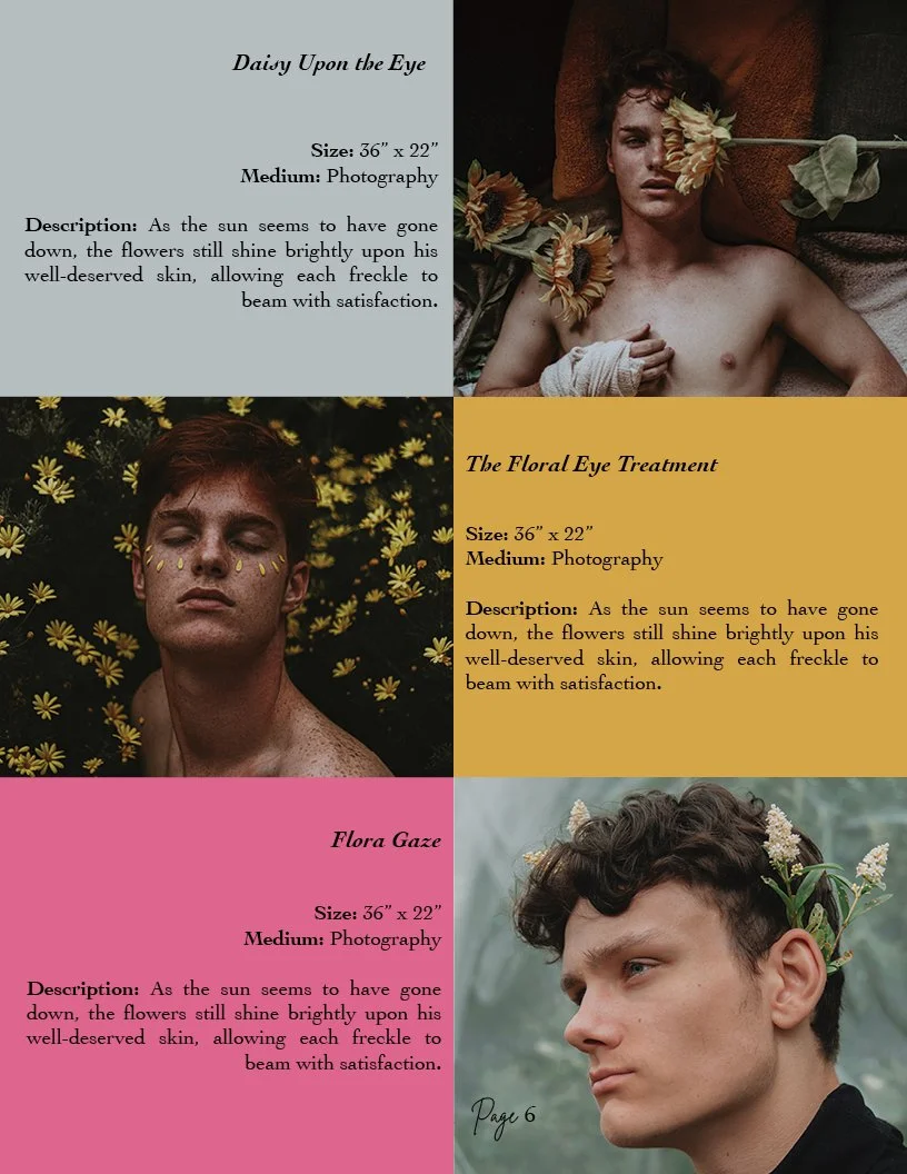
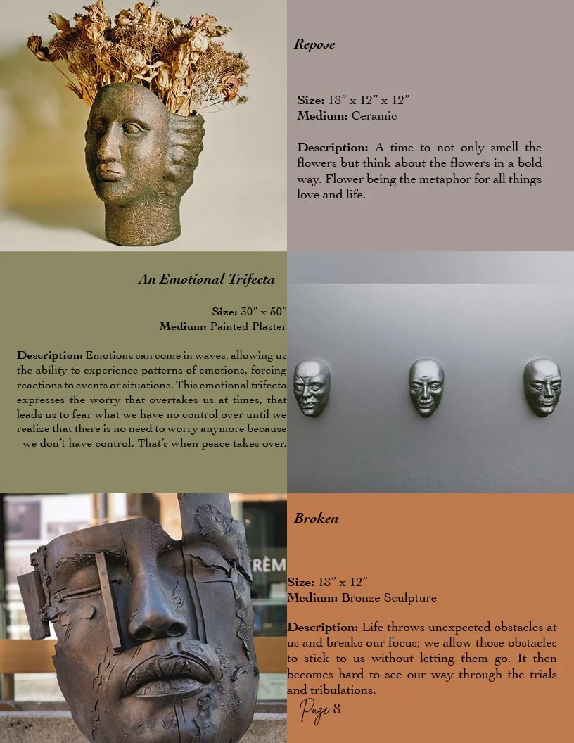
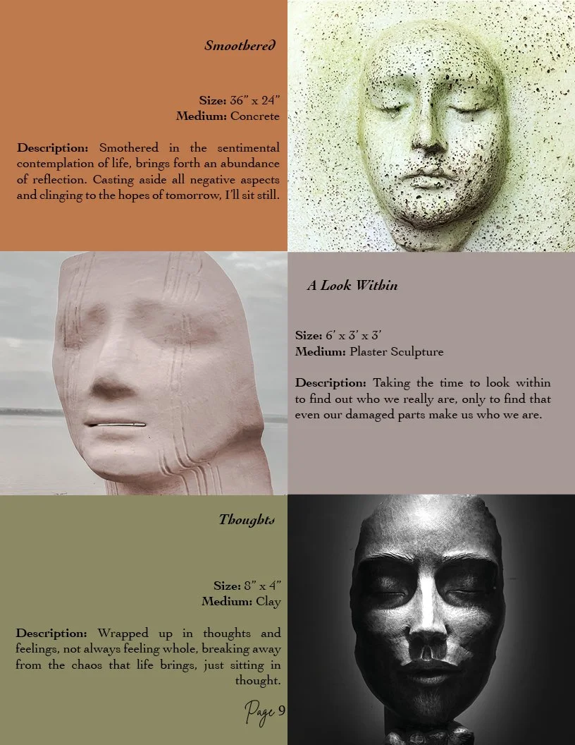
I designed a symmetrical grid system that created consistency across the catalog while allowing each artist’s work to remain unique.
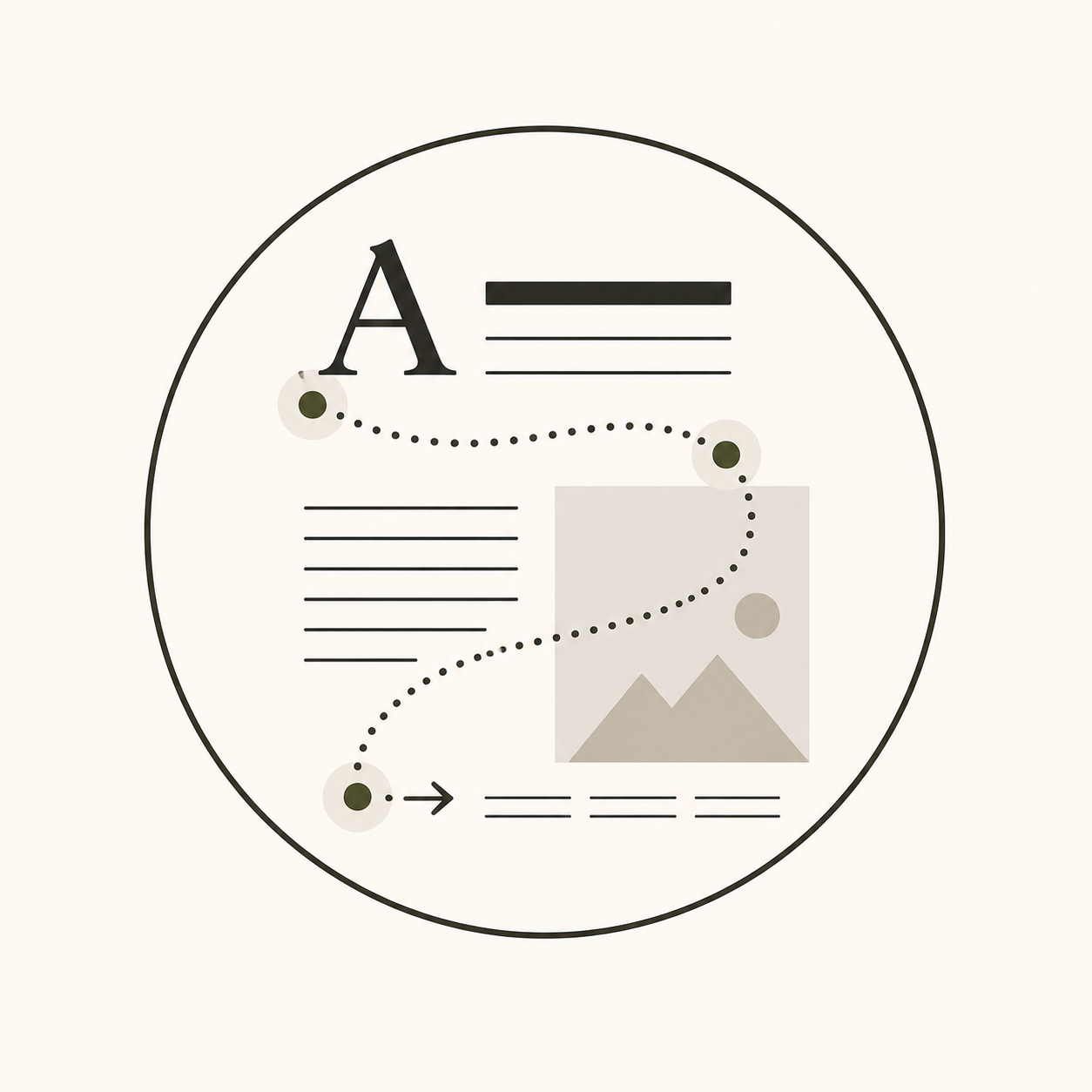
Hierarchy That Guides the Eye…
Typography was carefully structured to lead readers through the content, creating a natural flow from artist introduction to featured work.
Color as a Storytelling Tool…
Each artist’s section features colors inspired by their artwork, creating individual identity without changing the overall layout.




Reflection
This project strengthened my understanding of editorial layout and how thoughtful design helps people navigate information. I discovered that many of the same principles used in publication design—clear hierarchy, intentional spacing, and visual flow—also apply to designing effective websites and digital experiences. It reinforced my belief that good design isn't just about aesthetics; it's about making information feel clear, intuitive, and engaging.